Silver (PSLV, SLV) is one of the most thermally and electrically conductive materials on this world. Silver is also the best light reflecting element. Silver is being used for war equipment like aircraft and tank engines, automobiles,electrical connections, guns, torpedoes, radiator connections, rockets,warheads, submarines. In fact, silver is essential during wartime periods.
Silver-Investor.com points out:
"Notice that in a wartime period, silver use increases dramatically. In the nearly 63 years since that review was issued, no substitute has been found in nature for silver and its fantastic characteristics. Many revolutionary uses for silver were discovered as a consequence of war industry research, and what was true in 1942 is truer still today. A modern war machine MUST have silver to function at peak efficiency. Aerospace and jet aircraft technology could not exist without silver, nor could missiles and satellites. Countries which don't have adequate silver supplies are at serious strategic disadvantage in wartime, most likely to the point of being on the losing side."
It's no surprise that silver will go up during wartime.
The question is, how much will it go up?
First you need to understand that globally, the U.S. is the king in waging war (Figure 1). This is why I'll only focus on defense spending in the U.S.
The first big war started in 1860 and ended in 1865 (Civil War). Defense spending went up to 12% of GDP. The silver price went up dramatically from 1.292 $US/ounce to 2.939 $US/ounce. That's a 130% increase.
Next on, the two biggest World Wars of the 20th century were WWI and WWII. Defense spending during this wartime period similarly spiked upwards.
During WWI, we had a peak of 18% defense spending as a % of GDP. That caused the silver price to rise from 0.5 $US/ounce to 1.34 $US/ounce. That's a 170% increase. During WWII, which started in 1939 and ended in 1945, caused defense spending to go to 37% of GDP (Chart 2). As a result of this, the silver price went from 0.35 $US/ounce to 0.81 $US/ounce (Chart 1). That's a 130% increase.
After these three big wars, there hasn't been much activity other than the Vietnamese war from 1955 to 1975, which is of a much smaller magnitude (10 times smaller). To have a significant increase in the silver price though (specifically due to war), annual defense spending would need to at least go above 10% of GDP, or $US 1.5 trillion/annum.
Today, U.S. defense spending is at 6%, of which the war in Iraq and Afghanistan are the most costly. To date the U.S. already spent $US 1.4 trillion on these two wars. Liveleak is estimating the cost of the Iraq-Afghanistan war in the amount of $US 4 trillion. The Iraq-Afghanistan war is coming to an end though, as the U.S. has announced plans to reduce its presence in Iraq and Afghanistan.
The next significant war coming up would undoubtedly be the Iranian war, which could cost trillions of dollars. This war could start as early as in November 2012 as Michael Pento pointed out on his weekly Pento Portfolios Strategies update on 30 August 2012. Israel is likely to strike Iran's nuclear sites before the November elections. Trend forecasters like Gerald Celente have said just recently how this Iranian war could lead to the start of WWIII. The reason is that China and Russia are in support of Iran. China especially depends on oil imports from Iran (11% of Chinese oil is imported from Iran) and is defying the U.S. sanctions on Iran. These events have already create geopolitical tensions. In June 2012, the four countries: Syria, Russia, China and Iran were rallying troops along the Syrian coast, preparing for war-games in the Middle East. Today, several Iranian and Chinese warships/submarines are settled along the Syrian coast, ready to protect Assad's forces in Syria against any NATO intervention. Russia has already abandoned Syria to avoid getting caught up in the escalating crisis.
If this WWIII were to happen, the next significant spike in U.S. defense spending could eventually come to fruition. Investors can speculate on this outcome by buying Proshares Ultra Silver (AGQ).
And yet again, the correlation exists.

Finally, war is inflationary.
Silver-Investor.com points out:
"Notice that in a wartime period, silver use increases dramatically. In the nearly 63 years since that review was issued, no substitute has been found in nature for silver and its fantastic characteristics. Many revolutionary uses for silver were discovered as a consequence of war industry research, and what was true in 1942 is truer still today. A modern war machine MUST have silver to function at peak efficiency. Aerospace and jet aircraft technology could not exist without silver, nor could missiles and satellites. Countries which don't have adequate silver supplies are at serious strategic disadvantage in wartime, most likely to the point of being on the losing side."
It's no surprise that silver will go up during wartime.
The question is, how much will it go up?
First you need to understand that globally, the U.S. is the king in waging war (Figure 1). This is why I'll only focus on defense spending in the U.S.
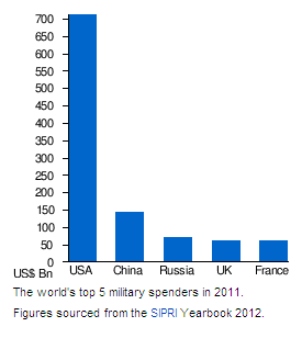 |
| Figure 1: Top 5 military spenders |
The first big war started in 1860 and ended in 1865 (Civil War). Defense spending went up to 12% of GDP. The silver price went up dramatically from 1.292 $US/ounce to 2.939 $US/ounce. That's a 130% increase.
Next on, the two biggest World Wars of the 20th century were WWI and WWII. Defense spending during this wartime period similarly spiked upwards.
During WWI, we had a peak of 18% defense spending as a % of GDP. That caused the silver price to rise from 0.5 $US/ounce to 1.34 $US/ounce. That's a 170% increase. During WWII, which started in 1939 and ended in 1945, caused defense spending to go to 37% of GDP (Chart 2). As a result of this, the silver price went from 0.35 $US/ounce to 0.81 $US/ounce (Chart 1). That's a 130% increase.
(click to enlarge)
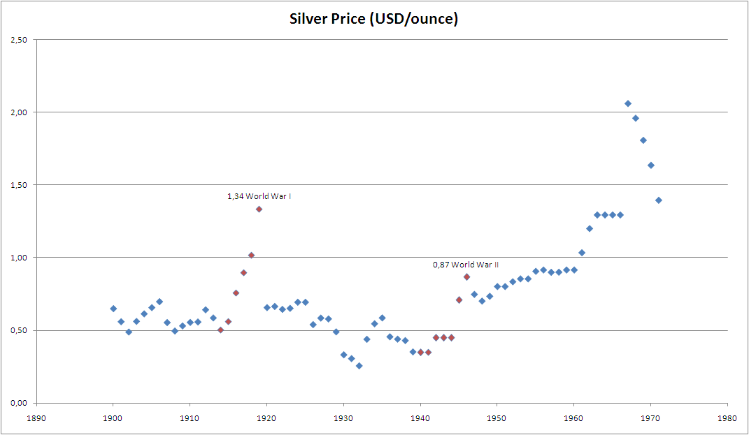 |
Chart 1: Silver Price During WWI and WWII
|
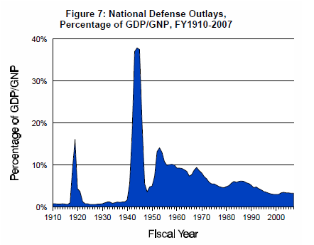 |
| Chart 2: Defense Spending during WWI and WWII |
After these three big wars, there hasn't been much activity other than the Vietnamese war from 1955 to 1975, which is of a much smaller magnitude (10 times smaller). To have a significant increase in the silver price though (specifically due to war), annual defense spending would need to at least go above 10% of GDP, or $US 1.5 trillion/annum.
Today, U.S. defense spending is at 6%, of which the war in Iraq and Afghanistan are the most costly. To date the U.S. already spent $US 1.4 trillion on these two wars. Liveleak is estimating the cost of the Iraq-Afghanistan war in the amount of $US 4 trillion. The Iraq-Afghanistan war is coming to an end though, as the U.S. has announced plans to reduce its presence in Iraq and Afghanistan.
The next significant war coming up would undoubtedly be the Iranian war, which could cost trillions of dollars. This war could start as early as in November 2012 as Michael Pento pointed out on his weekly Pento Portfolios Strategies update on 30 August 2012. Israel is likely to strike Iran's nuclear sites before the November elections. Trend forecasters like Gerald Celente have said just recently how this Iranian war could lead to the start of WWIII. The reason is that China and Russia are in support of Iran. China especially depends on oil imports from Iran (11% of Chinese oil is imported from Iran) and is defying the U.S. sanctions on Iran. These events have already create geopolitical tensions. In June 2012, the four countries: Syria, Russia, China and Iran were rallying troops along the Syrian coast, preparing for war-games in the Middle East. Today, several Iranian and Chinese warships/submarines are settled along the Syrian coast, ready to protect Assad's forces in Syria against any NATO intervention. Russia has already abandoned Syria to avoid getting caught up in the escalating crisis.
If this WWIII were to happen, the next significant spike in U.S. defense spending could eventually come to fruition. Investors can speculate on this outcome by buying Proshares Ultra Silver (AGQ).
And yet again, the correlation exists.