S&P announces addition of Endeavour Silver on 22 March 2021.
Posts tonen met het label Endeavour. Alle posts tonen
Posts tonen met het label Endeavour. Alle posts tonen
maandag 15 maart 2021

vrijdag 11 september 2020
Why Endeavour Silver is the Number One Silver Miner
Endeavour Silver has the largest growth potential due to its Terronera project and has the lowest P/NAV due to its large silver asset base of 200 million AgEq.

donderdag 25 januari 2018
Stock Screener: Day 6: Endeavour Silver (EXK)
Nissan went up, so we need to lock in profits.
If I don't have any ideas anymore what to buy, I use the stock screener.
What you want to do is filter on 4 attributes: market cap, P/E, dividend yield and percentage change.
1) Market Cap: do not choose small companies as they are mostly fraudulent or don't have sustainable earnings. Don't choose big companies because these are not volatile enough to get fast profits from. I'd filter between 200 million and 4 billion.
2) P/E ratio: choose the companies with the lowest P/E ratio, these companies are dirt cheap while still having earnings. Cheap is below P/E of 5. But do not choose below P/E of 2 because those are mostly companies that are going bankrupt or have bad growth.
3) Dividend yield: always choose companies that have dividends, because these companies have real earnings and can prove they have sustainable earnings to reward investors. The higher the better of course, but don't push it above 7% as those companies probably don't have the money to pay out dividends on a regular basis. I'd go for companies with dividends between 3% and 7%.
4) Volatility: don't choose companies that are so volatile. Maximum year over year change should be between the 20% range.
This time I just bought Endeavour Silver because I think the silver price will go up and Endeavour Silver has a nice growth profile.
If I don't have any ideas anymore what to buy, I use the stock screener.
What you want to do is filter on 4 attributes: market cap, P/E, dividend yield and percentage change.
1) Market Cap: do not choose small companies as they are mostly fraudulent or don't have sustainable earnings. Don't choose big companies because these are not volatile enough to get fast profits from. I'd filter between 200 million and 4 billion.
2) P/E ratio: choose the companies with the lowest P/E ratio, these companies are dirt cheap while still having earnings. Cheap is below P/E of 5. But do not choose below P/E of 2 because those are mostly companies that are going bankrupt or have bad growth.
3) Dividend yield: always choose companies that have dividends, because these companies have real earnings and can prove they have sustainable earnings to reward investors. The higher the better of course, but don't push it above 7% as those companies probably don't have the money to pay out dividends on a regular basis. I'd go for companies with dividends between 3% and 7%.
4) Volatility: don't choose companies that are so volatile. Maximum year over year change should be between the 20% range.
This time I just bought Endeavour Silver because I think the silver price will go up and Endeavour Silver has a nice growth profile.
zaterdag 18 mei 2013
The Great Disconnect in the Paper and Physical Precious Metals Market
Over the last few months, precious metals investors have seen their net worth decline due to declining precious metals prices (GLD), (SLV). A lot of this decline in precious metals prices was due to a decrease in demand, which was the result of selling by hedge funds as the World Gold Council reported here.
First quarter gold demand of 963 tonnes was down 13% compared with Q1 2012 due to an outflow in the total gold ETF holdings of 177 tonnes. 2013 marks the first year in a decade where ETF's are actually selling gold. While ETF holdings were reduced, this selling has been countered by an increase in physical demand for gold by China and India. Total demand in China rose 20% to 294 tonnes in Q1 2013 as compared to Q1 2012 (50 tonnes increase).
This huge increase in demand for physical gold can be witnessed on Chart 1, which gives the net imports of gold from Hong Kong to China.
While Chinese demand for gold was strong, Indian demand increased at an even higher pace. The Indian demand for gold increased 27% on the same quarter last year to 257 tonnes.
On the supply side we see a total increase of 1% in the first quarter of 2013 as compared to Q1 2012. Mine production increased 4% while recycling of gold decreased 4%.
So, the reason for the decline in precious metals prices is evident from an increase in supply (mine production increased) and a decrease in demand for gold (ETF outflows) (Chart 2). But there is an important point I need to make here. While the supply side is pretty constant at 1% increase, the demand side is the critical indicator we need to look at with its 13% decline. The decline was a result of hedge funds converting their gold holdings into equities. The Dow Jones (DIA) hit an all time high last week, fueled by a bullish prospect in the equity market of Japan, which on itself was a result of the massive Japanese monetary stimulus announced in April 2013. Although investors are cheering the bull market in equities, the macroeconomic conditions keep worsening. A few examples were a deterioration in PMI, capacity utilization, ISM manufacturing, vehicle sales, ADP employment, initial claims, PPI, mortgage applications, wages.
To see what this means for gold, read on here.
First quarter gold demand of 963 tonnes was down 13% compared with Q1 2012 due to an outflow in the total gold ETF holdings of 177 tonnes. 2013 marks the first year in a decade where ETF's are actually selling gold. While ETF holdings were reduced, this selling has been countered by an increase in physical demand for gold by China and India. Total demand in China rose 20% to 294 tonnes in Q1 2013 as compared to Q1 2012 (50 tonnes increase).
This huge increase in demand for physical gold can be witnessed on Chart 1, which gives the net imports of gold from Hong Kong to China.
 |
On the supply side we see a total increase of 1% in the first quarter of 2013 as compared to Q1 2012. Mine production increased 4% while recycling of gold decreased 4%.
(click to enlarge)
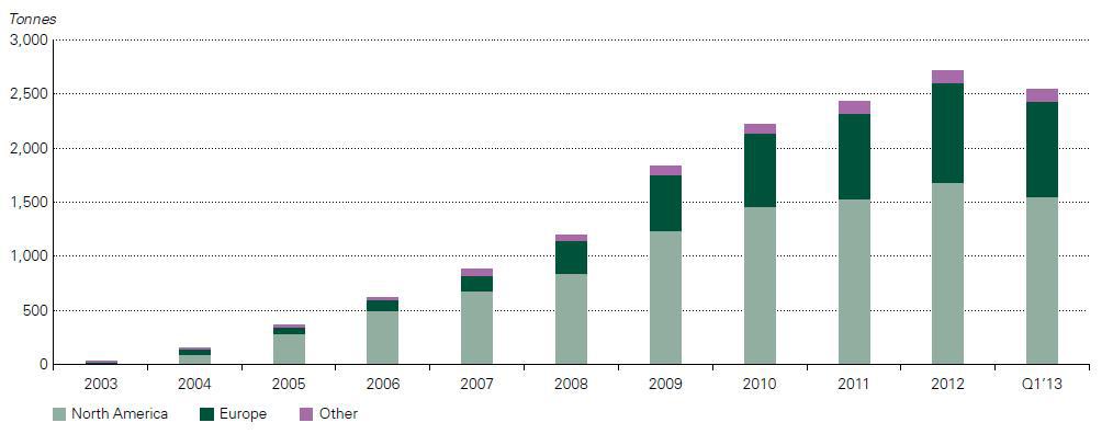 |
So, the reason for the decline in precious metals prices is evident from an increase in supply (mine production increased) and a decrease in demand for gold (ETF outflows) (Chart 2). But there is an important point I need to make here. While the supply side is pretty constant at 1% increase, the demand side is the critical indicator we need to look at with its 13% decline. The decline was a result of hedge funds converting their gold holdings into equities. The Dow Jones (DIA) hit an all time high last week, fueled by a bullish prospect in the equity market of Japan, which on itself was a result of the massive Japanese monetary stimulus announced in April 2013. Although investors are cheering the bull market in equities, the macroeconomic conditions keep worsening. A few examples were a deterioration in PMI, capacity utilization, ISM manufacturing, vehicle sales, ADP employment, initial claims, PPI, mortgage applications, wages.
To see what this means for gold, read on here.
Abonneren op:
Posts (Atom)