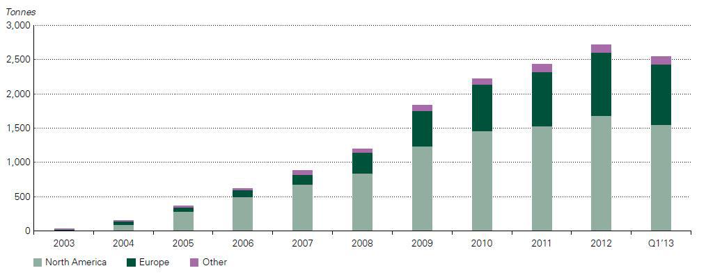
Base metals should spike as inventories head lower.
- List of Correlations
- Gold Checklist
- Copper Checklist
- Gold Forecaster
- Oil Forecaster
- Stock Forecaster
- Bond Forecaster
- USD Forecaster
- Poo Forecaster
- Bitcoin Checklist
- Q Ratio
- Stock Valuation
- Leading/Coincident Indicator
- Misery Index
- Junk Bonds Vs. Stocks
- Currency Vs. Bonds
- Yield Curve Vs. Fed Funds Rate
- U.S. Bond Yields
- Dividend Yield Vs. Bond Yield
- QE Vs. Bond Yields
- Money Supply
- Dow Theory
- Excess Reserves
- Central Bank Balance Sheets
- Fed Balance Sheet Vs. Dow Jones
- Credit Spread Vs S&P
- Total credit Vs. Dow Jones
- Debt
- Debt Vs. Delinquency
- % Debt Held by Foreigners
- Interest Payment on Government Debt
- Disposable Income Vs. Housing
- Retail Sales Vs. Disposable Income
- Tax Revenue Vs. Stocks
- Tax Revenue Vs. Savings Rate
- NIIP Vs. Currency
- Trade Balance Vs. Currency
- Deficit
- Deficit to Outlay Ratio
- China Power Consumption Vs. China GDP
- Freight Vs. GDP
- Inventory Vs. GDP
- PCE Vs. GDP
- GDP Vs. Trade Balance
- GDP Vs. 10 Year Bond Yield
- GDP Vs. PMI
- Profits Vs. Employment
- Employment-Population Ratio Vs. Wages
- Employment-Population Ratio Vs. GDP per Capita
- Unemployment Vs. GDP
- Part-time Employment
- Productivity Vs. CPI
- Output Gap Vs. CPI
- Taylor Rule Rate Vs. Gold
- PPI/CPI/PCE
- Retail Sales Vs. CPI
- 2 Year Vs. LIBOR/SOFR Vs. Fed Funds Rate
- Loan Growth Vs. Fed Funds Rate
- Fed Funds Rate Vs. CPI
- Fed Funds Rate Vs. Unemployment
- Delinquencies Vs. Unemployment
- Delinquency Vs. Fed Funds Rate
- Labor Force Vs. Unemployment
- Non-Farm Payrolls Vs. Unemployment
- Quits Rate Vs. Wage Inflation
- Wage Inflation Vs. Unemployment
- Wage Inflation Vs. CPI
- M2 Vs. CPI
- Capacity Utilization Vs. CPI
- Capacity Utilization Vs. Unemployment
- New Homes Vs. Rents
- Lumber Vs. Housing
- Savings Vs. Housing
- Housing Starts Vs. Unemployment
- Initial Jobless Claims Vs. S&P
- Consumer Sentiment Vs. S&P
- Durable Goods Orders Vs. S&P
- Building Permit Vs. Housing
- Construction Vs. Housing
- Adjustable Mortgage Vs. Fed Funds Rate
- Fixed Mortgage Rates Vs. 30 Year Bond Yield
- MZM Vs. 10 Year Bond Yield
- Gold Vs. 10 Year Bond Yield
- Dow/Gold Ratio
- GOFO Vs. Gold
- Gold/Silver COMEX
Posts tonen met het label metals. Alle posts tonen
zondag 1 oktober 2023
donderdag 10 november 2022
Base metals rebound coming
The China credit impulse is forecasting a rebound in base metals.
woensdag 25 mei 2022
zaterdag 29 mei 2021
Rare Earth Metals
Rare earth metal supply is growing at a rate of 5% per year.
Most of the supply/reserves come from China and U.S.A.
Demand was projected to be 10% per year. This will increase as more clean energy demand will arrive.
vrijdag 8 februari 2019
Gold Forecaster Index: Caution Advised
Be cautious, stay in cash.
zaterdag 18 mei 2013
The Great Disconnect in the Paper and Physical Precious Metals Market
Over the last few months, precious metals investors have seen their net worth decline due to declining precious metals prices (GLD), (SLV). A lot of this decline in precious metals prices was due to a decrease in demand, which was the result of selling by hedge funds as the World Gold Council reported here.
First quarter gold demand of 963 tonnes was down 13% compared with Q1 2012 due to an outflow in the total gold ETF holdings of 177 tonnes. 2013 marks the first year in a decade where ETF's are actually selling gold. While ETF holdings were reduced, this selling has been countered by an increase in physical demand for gold by China and India. Total demand in China rose 20% to 294 tonnes in Q1 2013 as compared to Q1 2012 (50 tonnes increase).
This huge increase in demand for physical gold can be witnessed on Chart 1, which gives the net imports of gold from Hong Kong to China.
While Chinese demand for gold was strong, Indian demand increased at an even higher pace. The Indian demand for gold increased 27% on the same quarter last year to 257 tonnes.
On the supply side we see a total increase of 1% in the first quarter of 2013 as compared to Q1 2012. Mine production increased 4% while recycling of gold decreased 4%.
So, the reason for the decline in precious metals prices is evident from an increase in supply (mine production increased) and a decrease in demand for gold (ETF outflows) (Chart 2). But there is an important point I need to make here. While the supply side is pretty constant at 1% increase, the demand side is the critical indicator we need to look at with its 13% decline. The decline was a result of hedge funds converting their gold holdings into equities. The Dow Jones (DIA) hit an all time high last week, fueled by a bullish prospect in the equity market of Japan, which on itself was a result of the massive Japanese monetary stimulus announced in April 2013. Although investors are cheering the bull market in equities, the macroeconomic conditions keep worsening. A few examples were a deterioration in PMI, capacity utilization, ISM manufacturing, vehicle sales, ADP employment, initial claims, PPI, mortgage applications, wages.
To see what this means for gold, read on here.
First quarter gold demand of 963 tonnes was down 13% compared with Q1 2012 due to an outflow in the total gold ETF holdings of 177 tonnes. 2013 marks the first year in a decade where ETF's are actually selling gold. While ETF holdings were reduced, this selling has been countered by an increase in physical demand for gold by China and India. Total demand in China rose 20% to 294 tonnes in Q1 2013 as compared to Q1 2012 (50 tonnes increase).
This huge increase in demand for physical gold can be witnessed on Chart 1, which gives the net imports of gold from Hong Kong to China.
On the supply side we see a total increase of 1% in the first quarter of 2013 as compared to Q1 2012. Mine production increased 4% while recycling of gold decreased 4%.
So, the reason for the decline in precious metals prices is evident from an increase in supply (mine production increased) and a decrease in demand for gold (ETF outflows) (Chart 2). But there is an important point I need to make here. While the supply side is pretty constant at 1% increase, the demand side is the critical indicator we need to look at with its 13% decline. The decline was a result of hedge funds converting their gold holdings into equities. The Dow Jones (DIA) hit an all time high last week, fueled by a bullish prospect in the equity market of Japan, which on itself was a result of the massive Japanese monetary stimulus announced in April 2013. Although investors are cheering the bull market in equities, the macroeconomic conditions keep worsening. A few examples were a deterioration in PMI, capacity utilization, ISM manufacturing, vehicle sales, ADP employment, initial claims, PPI, mortgage applications, wages.
To see what this means for gold, read on here.
dinsdag 23 april 2013
Is the gold there?
As the gold stock at the COMEX keeps dropping precipitously, we get more and more signs that the banks and warehouses don't have any gold or silver available for delivery. Junk silver premiums made a new high of 27% today. Chow Tai Fook in Hong Kong is out of gold bars. It's only a matter of time now, when this will become mainstream media.
Edit: On 24 april, registered gold hit a new low and total gold stock hit a new low at 8 million ounces. This drop is the largest one in years. Something is happening.
woensdag 19 december 2012
Correlation between Industrial Production Vs. CRB Metals Index
Thanks to Bob Garino, who commented on this article, I found out about the correlation between Industrial Production (manufacturing) and the CRB metals index.
Let's see if this correlation is correct.
I immediately see that from 1990 till 2000 the correlation doesn't fit. That period was a period where miners were in a bear market as metals prices declined and mining companies were getting worse and worse conditions for mining. Bonds were doing ok in that period.
So I'm a bit sceptical about this correlation. But I'll still add it to my list of correlations.
Let's see if this correlation is correct.
I immediately see that from 1990 till 2000 the correlation doesn't fit. That period was a period where miners were in a bear market as metals prices declined and mining companies were getting worse and worse conditions for mining. Bonds were doing ok in that period.
So I'm a bit sceptical about this correlation. But I'll still add it to my list of correlations.
| Chart 0: Industrial Production: Manufacturing |
| Chart 1: Industrial Production Index |
| Chart 2: CRB Metals Sub-Index |
Labels:
correlation,
CRB,
industrial,
metals,
production
maandag 17 december 2012
The Trend in Base Metals based on Capacity Utilization and China Manufacturing PMI
To forecast the trend in the price of base metals we have a lot of indicators to look at. Two of the most important indicators to look at in my perspective are capacity utilization and the China manufacturing PMI.
| Chart 1: Iron Ore Consumption by Continent |
| Chart 2: Iron Ore Production by Continent |
It would be wrong to only look at the capacity utilization of the U.S. to draw any conclusions on the prospects in the commodity market. It's essential to include China, South America and Australia/Canada into the equation.
To read the analysis, go here.
Labels:
base,
Capacity,
China,
correlation,
Iron ore,
metals,
Mining,
PMI,
Utilization
zondag 9 december 2012
Copper Bullish Move Confirmed
Dan Norcini from KWN Metals Wrap has confirmed my bullish prediction on the copper price:
"The copper market is in an uptrend. The copper market looks like it is going to break higher due to an improving economy in China and the improving housing market in the U.S. If copper is going to make a run higher, silver is going to go higher and the bears are going to have to cover."
Let's see what the coming months will bring. If Dan and I are right about a break out to the upside in the copper market, this could spark a run in the commodities and stock markets.
Chart 1 indicates that a huge move is about to come, as we are nearing the end of a wedge pattern.
"The copper market is in an uptrend. The copper market looks like it is going to break higher due to an improving economy in China and the improving housing market in the U.S. If copper is going to make a run higher, silver is going to go higher and the bears are going to have to cover."
Let's see what the coming months will bring. If Dan and I are right about a break out to the upside in the copper market, this could spark a run in the commodities and stock markets.
Chart 1 indicates that a huge move is about to come, as we are nearing the end of a wedge pattern.
| Chart 1: Copper Price |
dinsdag 20 november 2012
Bullish on Precious Metals
One very good indicator for higher precious metals prices is the lease rate.
I wish I could show the silver lease rates, but Kitco is cheating on us, their chart only shows a flat line...
But all we need is the gold lease rate and then just extrapolate it to silver lease rates.
As I predicted here, it was time to buy gold and silver. And now it's completely obvious that they will do good as lease rates are steadily increasing. I doubled my position in silver.
| Chart 1: Gold Lease Rates |
I wish I could show the silver lease rates, but Kitco is cheating on us, their chart only shows a flat line...
| Chart 2: Silver Lease Rates (flat lines since 2 November 2012) |
Labels:
lease rates,
metals,
precious
dinsdag 16 oktober 2012
Capacity Utilization Rate at 78.3% in September 2012
For all those who are concerned that precious metals will go down for the rest of this year, there is some light at the end of the tunnel.
This statement can be confirmed if we look at the resource producing countries of Canada, Russia and Brazil. All of them are in a rising trend.
The only country that isn't doing as well is Australia, where the capacity utilization rate declined over the entire year.
The probable reason for Australia's declining capacity utilization rate is a slowdown in China, which can also be seen in their capacity utilization rate, which is at a record low of 60% according to the IMF.
Capacity utilization rate for the total industry was up to 78.3% in September 2012 from 78% in August 2012. In particular, the mining industry recovered well, from 88.4% in August to 89.1% in September.
While looking at these numbers, I don't see precious metals crashing just yet.
| Table 1: Capacity Utilization Rate |
| Chart 1: Capacity Utilization Rate |
| Chart 2: Brazil Capacity Utilization |
| Chart 3: Russia Capacity Utilization |
| Chart 4: Canada Capacity Utilization |
| Chart 5: Australia Capacity Utilization |
| Chart 6: China Capacity Utilization Rate |
Labels:
Capacity Utilization,
Gold,
metals,
precious,
silver
maandag 9 januari 2012
Government Bond Yield Extremes
Today I found an interesting article on Bloomberg about 1 Year German government bond yields going under zero (see Figure 1).
It is amazing that people want to lend money to the German government while paying extra money (1% of their investment) a year from now. Thereby losing money with their investment.
I can think of only one reason for this and that is: "your money is not safe in the bank".
Why would someone not just put their savings in a bank which pays around 1,5 % yield a year. Instead they want to lose money by buying German government bonds. Exactly because your cash is not safe in your bank. At any time your bank will go bankrupt. I know Germany is a safe haven, but there are far better alternatives here like buying precious metals: gold and silver.
Figure 1:
The 1 year US government bond yield is really almost the same. Amazingly low yields with minimal return in an inflationary environment (see Figure 2).
Figure 2:
Completely the opposite is the 1 year Greece Government Bond Yield (see Figure 3), which is surging past a record 380 %, which basically means a default on their debt.
Figure 3:
It amazes me that people still buy these government bonds, knowing that the bond bull market is coming to its end.
US government bond yields have run a 30 year bull market (1980-2012). I think it's time for the market to start moving the money from government bonds to precious metals.
Abonneren op:
Posts (Atom)