- List of Correlations
- Gold Checklist
- Copper Checklist
- Gold Forecaster
- Oil Forecaster
- Stock Forecaster
- Bond Forecaster
- USD Forecaster
- Poo Forecaster
- Bitcoin Checklist
- Q Ratio
- Stock Valuation
- Leading/Coincident Indicator
- Misery Index
- Junk Bonds Vs. Stocks
- Currency Vs. Bonds
- Yield Curve Vs. Fed Funds Rate
- U.S. Bond Yields
- Dividend Yield Vs. Bond Yield
- QE Vs. Bond Yields
- Money Supply
- Dow Theory
- Excess Reserves
- Central Bank Balance Sheets
- Fed Balance Sheet Vs. Dow Jones
- Credit Spread Vs S&P
- Total credit Vs. Dow Jones
- Debt
- Debt Vs. Delinquency
- % Debt Held by Foreigners
- Interest Payment on Government Debt
- Disposable Income Vs. Housing
- Retail Sales Vs. Disposable Income
- Tax Revenue Vs. Stocks
- Tax Revenue Vs. Savings Rate
- NIIP Vs. Currency
- Trade Balance Vs. Currency
- Deficit
- Deficit to Outlay Ratio
- China Power Consumption Vs. China GDP
- Freight Vs. GDP
- Inventory Vs. GDP
- PCE Vs. GDP
- GDP Vs. Trade Balance
- GDP Vs. 10 Year Bond Yield
- GDP Vs. PMI
- Profits Vs. Employment
- Employment-Population Ratio Vs. Wages
- Employment-Population Ratio Vs. GDP per Capita
- Unemployment Vs. GDP
- Part-time Employment
- Productivity Vs. CPI
- Output Gap Vs. CPI
- Taylor Rule Rate Vs. Gold
- PPI/CPI/PCE
- Retail Sales Vs. CPI
- 2 Year Vs. LIBOR/SOFR Vs. Fed Funds Rate
- Loan Growth Vs. Fed Funds Rate
- Fed Funds Rate Vs. CPI
- Fed Funds Rate Vs. Unemployment
- Delinquencies Vs. Unemployment
- Delinquency Vs. Fed Funds Rate
- Labor Force Vs. Unemployment
- Non-Farm Payrolls Vs. Unemployment
- Quits Rate Vs. Wage Inflation
- Wage Inflation Vs. Unemployment
- Wage Inflation Vs. CPI
- M2 Vs. CPI
- Capacity Utilization Vs. CPI
- Capacity Utilization Vs. Unemployment
- New Homes Vs. Rents
- Lumber Vs. Housing
- Savings Vs. Housing
- Housing Starts Vs. Unemployment
- Initial Jobless Claims Vs. S&P
- Consumer Sentiment Vs. S&P
- Durable Goods Orders Vs. S&P
- Building Permit Vs. Housing
- Construction Vs. Housing
- Adjustable Mortgage Vs. Fed Funds Rate
- Fixed Mortgage Rates Vs. 30 Year Bond Yield
- MZM Vs. 10 Year Bond Yield
- Gold Vs. 10 Year Bond Yield
- Dow/Gold Ratio
- GOFO Vs. Gold
- Gold/Silver COMEX
Posts tonen met het label zerohedge. Alle posts tonen
woensdag 7 augustus 2019
zaterdag 7 december 2013
How to Monitor the Labor Force Participation Rate
A Zerohedge article made me think about the unemployment rate. Apparently, year over year, the civilian population rose while the labor force declined. You might say: "What does this mean?".
Let's first look at this informative video from Salman Khan:
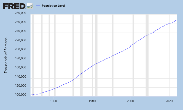
The yellow circle is the civilian population, people older than 16+ years, which can be found here:
Let's first look at this informative video from Salman Khan:
The yellow circle is the civilian population, people older than 16+ years, which can be found here:
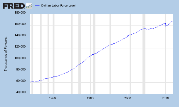
The green circle is the labor force, people who can work (employed + unemployed), which can be found here:
This conveniently gives me the labor participation rate by dividing them: (labor force/civilian population):
You can see that since 2000, the labor force participation rate has been declining and it is even declining faster after 2008. When the labor force participation rate declines, it becomes more and more difficult to support the economy as a smaller amount of people are working for an increasing population. This will lead to higher deficits, higher taxes, less savings etc... So the labor force participation rate is a great economic indicator to watch.
If you look at the figure below, we see that the yellow circle is growing faster than the green circle. And just recently, the green circle is even declining. While the yellow circle is growing. The yellow circle can only grow if young people (younger than 16 years) come into that yellow circle.
This also means that people are going out of the labor force (green circle) at a faster rate than young people are getting into the population (yellow circle). This is probably due to people who are discouraged or going on retirement.
As the unemployment rate actually declined to 7% now, these people leaving the labor force are mostly unemployed.
It all sounds very difficult, just let it sink in...
Labels:
Academy,
force,
Khan,
labor,
participation,
population,
rate,
zerohedge
zaterdag 19 januari 2013
Correlation: Real Interest Rates Vs. Gold Price
I came across a Zerohedge chart and tried to duplicate the chart.
Very interesting correlation and tool to monitor.
The chart is about how gold goes up when real interest rates (adjusted for inflation CPIAUCSL) on 10 Year Treasuries approach zero.
And as you can see, the red line (10 year treasuries adjusted for inflation) is now exactly at zero. So that is bullish for gold.
The red chart right = Yields on 10 year treasuries adjusted for CPI.
The green chart left = Percentage change in Gold.
| Chart 1: Gold (% change) Vs. Real 10 Year Interest Rates (% change) |
Labels:
10 year treasuries,
bonds,
correlation,
Gold,
inflation,
zerohedge
woensdag 19 december 2012
Redemption of Paulson Advantage Funds
Zerohedge reminds us why gold has been falling the last several weeks.
Paulson's Advantage and Advantage Plus funds were said to be dumped by Morgan Stanley. And because 30% of Paulson's portfolio is in gold (GLD) and another huge percentage in gold mining stocks, this dragged down the gold market and more importantly the gold mining market. To see a recent filing go here.
I don't believe this is that significant though. Morgan Stanley clients only comprise $100 million of the combined $5.7 billion Advantage and Advantage Plus funds. That's 1.7% and not even worth mentioning. By the way, the clearing volume at the London exchange can be as much as $3.5 billion a day. So $100 million is nothing.
I wouldn't put too much thought in this. Paulson and Soros are still bullish as far as I can see.
(if I make mistakes in any numbers mentioned above, please tell me)
Paulson's Advantage and Advantage Plus funds were said to be dumped by Morgan Stanley. And because 30% of Paulson's portfolio is in gold (GLD) and another huge percentage in gold mining stocks, this dragged down the gold market and more importantly the gold mining market. To see a recent filing go here.
I don't believe this is that significant though. Morgan Stanley clients only comprise $100 million of the combined $5.7 billion Advantage and Advantage Plus funds. That's 1.7% and not even worth mentioning. By the way, the clearing volume at the London exchange can be as much as $3.5 billion a day. So $100 million is nothing.
I wouldn't put too much thought in this. Paulson and Soros are still bullish as far as I can see.
(if I make mistakes in any numbers mentioned above, please tell me)
Abonneren op:
Posts (Atom)