It is a real mystery how the European unemployment rate is 12%, while the U.S. unemployment rate is 6%, half of the European unemployment rate.
Obviously, the U.S. unemployment rate is not a good measure anymore for the state of the U.S. jobs market. Ever since the crisis started in 2009, the labor force participation rate has declined, so the jobs market was not improving. Recessions occur when the labor force participation rate drops, which means we're in a recession since 2008 and have not gone out of this recession at all.
The U.S. unemployment rate should have soared to 10% at least, when counting all the people out of the labor force and this correlation proves it. Also, if next quarter has negative GDP as well, then we are officially in recession, which is very plausible, considering the decline in the labor force participation rate.
So which chart do you take, the red pill, or the blue pill? Contrary to the Matrix, the red pill is fantasy, while the blue pill is reality.
You've got to give Peter credit for this. Higher costs (labor costs or corporate taxes) in a business will always flow to the consumer. Because this is the only way a business can stay profitable. Of course, higher consumer prices are not sustainable, because the consumer won't buy your product. It's all supply and demand. Which means...
...the other way to stay in business is of course to just fire the employees. See this Salman Khan video:
We all know the Unemployment Rate is rigged by the U.S. government. A much better indicator is the Labor Force Participation Rate. Historically, we see a negative correlation between the Labor Force Participation Rate and the Unemployment Rate.
Whenever the LFPR goes up (blue chart), we see a decline in the unemployment rate (red chart) and vice versa. This correlation has been true until 2008, where the U.S. government falsified the unemployment numbers and added hedonic adjustments. The red line should be going upwards since 2010 if we include discouraged workers, part-time workers, disabled workers, etc...
So, the key is to look at the labor force participation rate.
More info here. Labor force participation rate = green circle divided by yellow circle = amount of people who are working or seeking for work
For more information, here is a chart with a longer time frame of the labor force participation rate for the working age population (25 - 54 years).
A Zerohedge article made me think about the unemployment rate. Apparently, year over year, the civilian population rose while the labor force declined. You might say: "What does this mean?".
Let's first look at this informative video from Salman Khan:
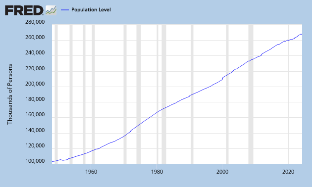
The yellow circle is the civilian population, people older than 16+ years, which can be found here:
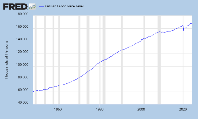
The green circle is the labor force, people who can work (employed + unemployed), which can be found here:
This conveniently gives me the labor participation rate by dividing them: (labor force/civilian population):
You can see that since 2000, the labor force participation rate has been declining and it is even declining faster after 2008. When the labor force participation rate declines, it becomes more and more difficult to support the economy as a smaller amount of people are working for an increasing population. This will lead to higher deficits, higher taxes, less savings etc... So the labor force participation rate is a great economic indicator to watch.
If you look at the figure below, we see that the yellow circle is growing faster than the green circle. And just recently, the green circle is even declining. While the yellow circle is growing. The yellow circle can only grow if young people (younger than 16 years) come into that yellow circle.
This also means that people are going out of the labor force (green circle) at a faster rate than young people are getting into the population (yellow circle). This is probably due to people who are discouraged or going on retirement.
As the unemployment rate actually declined to 7% now, these people leaving the labor force are mostly unemployed.
It all sounds very difficult, just let it sink in...
The non-farm payroll number is a leading indicator for the unemployment rate. Check the economic tracker to predict the NFP numbers.
Watch the household employment level vs. non-farm payrolls. Household employment level surveys actually include small businesses unlike non-farm payrolls. Household employment is a leading indicator as small businesses adapt much faster than large businesses.
NFP revisions.
There is another way to calculate the non-farm payroll numbers and this is called the JOLTS (Job Openings and Labor Turnover) data. When you subtract hires and separations from each other, you get the change in non-farm payroll numbers.
Change in NFP = Hires - Separations.
JOLTS data is more accurate than the NFP data (which gets revised a lot). You can use the JOLTS data to predict the NFP data and with NFP data, you can predict the trend of the unemployment rate.
Job gap. The US labor market has reached a critical threshold: The jobs-workers gap has turned negative, signalling that the economy has reached the flat side of the Beveridge curve. A further decline in job openings could push it into recession.