Posts tonen met het label payroll. Alle posts tonen

zaterdag 3 juli 2021

Household employment Vs. Non-farm Payrolls

The non-farm payrolls were better than expected in June 2021. However, something that the media didn't pick up is that household employment levels fell in June 2021.

It is important to watch the household employment level vs. non-farm payrolls. Household employment level surveys actually include small businesses unlike non-farm payrolls. Household employment is a leading indicator for non-farm payrolls as small businesses adapt much faster than large businesses. 


vrijdag 5 juni 2020

Non Farm Payrolls Smash Expectations

The market was expecting 7.25 million of job losses, but instead we gained 2.5 million jobs. This is a huge beat and should push stocks higher. We will see if these green shoots continue...

woensdag 21 augustus 2019

vrijdag 17 januari 2014

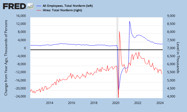
Change in Total Non Farm Payrolls Vs. Job Hires

A Zerohedge article describes how job hires are correlated to the change in payrolls.

A discrepancy occurred from 2010 onwards as layoffs went down.

1) The nonfarm payroll number is a measure of the number of U.S. workers in the economy that excludes proprietors, private household employees, unpaid volunteers, farm employees, and the unincorporated self-employed.

2) The job hire number is the amount of people that are actually getting a job per month. So if job hires increase, the amount of workers in the economy increase, if all else stays equal.

But the amount of workers in the economy also depends on the amount of layoffs.
=> Change in amount of workers in the economy (blue chart) = job hires (red chart) - layoffs

A discrepancy occurred from 2010 onwards as layoffs went down. So the increase in payrolls was not due to increased hiring, but due to a decrease in layoffs.

Conclusion: The importance of monitoring this chart is to know how much of the increase in payrolls is due to hiring. Because hiring is the real driver in the jobs market.


dinsdag 10 september 2013

Net Turnover Vs. Change in Non-Farm Payrolls Vs. Change in Unemployment Rate

The non-farm payroll number is a leading indicator for the unemployment rate. Check the economic tracker to predict the NFP numbers.


Watch the household employment level vs. non-farm payrolls. Household employment level surveys actually include small businesses unlike non-farm payrolls. Household employment is a leading indicator as small businesses adapt much faster than large businesses.


NFP revisions.


There is another way to calculate the non-farm payroll numbers and this is called the JOLTS (Job Openings and Labor Turnover) data. When you subtract hires and separations from each other, you get the change in non-farm payroll numbers.

Change in NFP = Hires - Separations.

JOLTS data is more accurate than the NFP data (which gets revised a lot). You can use the JOLTS data to predict the NFP data and with NFP data, you can predict the trend of the unemployment rate.

Job postings give an idea of the trend.
   

Daily Linkup data.


The Beveridge Curve states that the unemployment rate will rise when job vacancies drop below 5%.


Leading indicator for U.S. unemployment can be derived from the states data.


Distribution between native and foreign workers.


A good way to forecast the unemployment rate is to look at the S&P Global U.S. services PMI employment, reported via the flash PMI.


Employment PMI and unemployment rate are correlated.


Job gap. The US labor market has reached a critical threshold: The jobs-workers gap has turned negative, signalling that the economy has reached the flat side of the Beveridge curve. A further decline in job openings could push it into recession.

woensdag 30 januari 2013

ADP Report Vs. Unemployment Rate

Today we also found the ADP jobs numbers for the month of January 2013 and it came out to 192000 jobs. This is pretty good, but if you look at the trendline on Chart 1 we are still going down.

Job growth isn't keeping up with the rise in population, we need to have at least a payroll number above 200000 to reduce the unemployment rate.

The declining unemployment rate (blue dots) is not to be trusted because if it were real, the red bars would be going up, not down.

vrijdag 7 september 2012

Payrolls Rose 91000, less than forecast

Payroll numbers just came out and it's not good: 91000.

As I pointed out in this article it means we are bound to get higher unemployment numbers (even though unemployment is only 8.1% right now). This is because payroll numbers are a far better measure than the unemployment rate.

What happened? Gold and silver flew through the roof because QE3 is very probable now.

Chart 1: Silver

Chart 2: Gold

zaterdag 25 augustus 2012

Non-Farm Payrolls and Unemployment: Another Correlation

I came across an interesting Zerohedge article about the odds of QE3. In that article they point out that QE3 odds are based on unemployment rate and non-farm payroll numbers, which will be released in about two weeks.

Table 1: Zerohedge's odds table for QE3
Actually, I think this table is redundant because a rise in payrolls (Chart 1) always accompanies a decline in unemployment rate. We will need the chart of the working-age population (Chart 2) to perform the analysis.

I will tell you the details, in this article.


Chart 1: Non-farm payrolls
Chart 2: Working-age Population in the U.S.