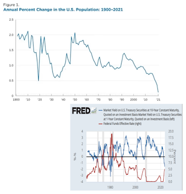
Lower population growth leads to inflation and a higher gold price.
A declining population leads to lower labor force participation (more old people and less young people). Lower labor force leads to higher debt to GDP as nobody works anymore but still consumes.
And finally, higher debt to GDP leads to higher gold prices.
The employment to population ratio is a leading indicator for wage growth. Because when there is lack of demand for workers, wages for these workers will naturally go down.
When we chart the employment to population ratio against the annual change in hourly earnings, we can clearly see this correlation.
A Zerohedge article made me think about the unemployment rate. Apparently, year over year, the civilian population rose while the labor force declined. You might say: "What does this mean?".
Let's first look at this informative video from Salman Khan:
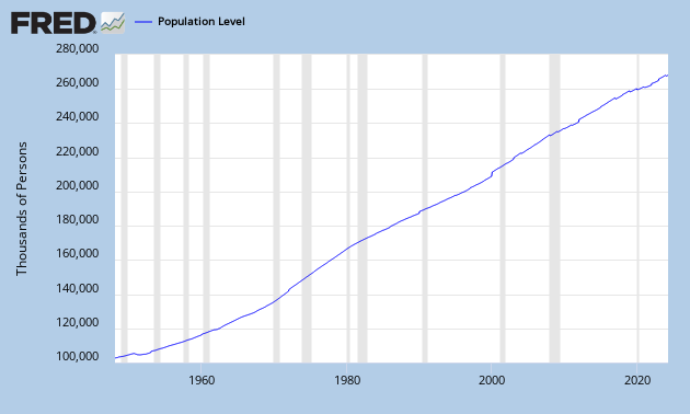
The yellow circle is the civilian population, people older than 16+ years, which can be found here:
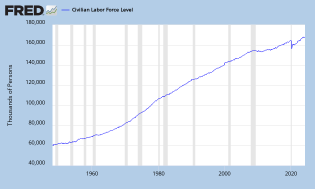
The green circle is the labor force, people who can work (employed + unemployed), which can be found here:
This conveniently gives me the labor participation rate by dividing them: (labor force/civilian population):
You can see that since 2000, the labor force participation rate has been declining and it is even declining faster after 2008. When the labor force participation rate declines, it becomes more and more difficult to support the economy as a smaller amount of people are working for an increasing population. This will lead to higher deficits, higher taxes, less savings etc... So the labor force participation rate is a great economic indicator to watch.
If you look at the figure below, we see that the yellow circle is growing faster than the green circle. And just recently, the green circle is even declining. While the yellow circle is growing. The yellow circle can only grow if young people (younger than 16 years) come into that yellow circle.
This also means that people are going out of the labor force (green circle) at a faster rate than young people are getting into the population (yellow circle). This is probably due to people who are discouraged or going on retirement.
As the unemployment rate actually declined to 7% now, these people leaving the labor force are mostly unemployed.
It all sounds very difficult, just let it sink in...
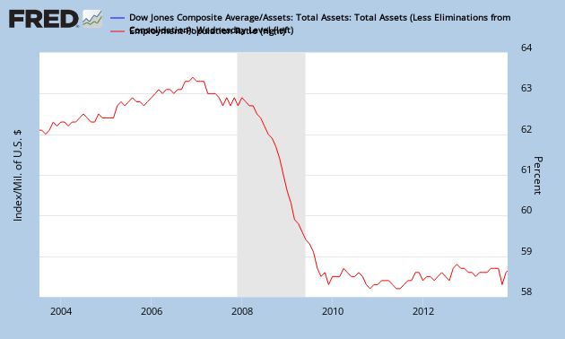
I read about a very unusual correlation at Zerohedge. Apparently, there is a similarity between the employment to population ratio (red graph) and the Potemkin Rally (blue graph). (The Potemkin Rally graph measures the ratio between the stock market and the Fed's Balance Sheet.)
There are implications if this correlation is true. It means that when the U.S. government prints money (otherwise known as QE), the blue graph goes down (in a scenario where the stock market flattens out). If the blue graph goes down, the red graph goes down too, which means the unemployment rate goes up.
This means we are venturing into a paradox. It means that we get to a stage where money printing makes the unemployment rate go up instead of down. Janet Yellen's QE won't help employment.
But the alternative is equally bad. Not to print money could make the stock market crash, which will also result in a declining blue chart. So we are now stuck between a rock and a hard place.
I like statistics that can't be fudged by the government and this is one of them: The Civilian Employment-Population Ratio. This measure is one of the best to evaluate the labor market. Each time when this ratio declines, we enter a recession. So this is a very good gauge in predicting bad periods in the overall economy.
A high ratio (above 70%) means that a lot of people are employed and this will result in a high GDP per capita. A low ratio (under 50%) is considered bad for GDP.
If we take a look at the percentage change per annum, we see that the trend for the real GDP per capita growth rate is down (blue chart). So real GDP isn't improving and this translates into a declining employment-population ratio (red chart).
As Karl Denninger explains, the amount of employed people as a percentage of the population hasn't improved since 2008. So the economy hasn't recovered a lot.