dinsdag 30 april 2013

J.P. Morgan Vault Doubles Registered Silver

I think this is very significant. J.P. Morgan's vault just recorded a doubling in registered silver coming from eligible silver.

You know what that means, allocation of silver, which means someone wants delivery. Open interest will start to come down with the decline in total silver stock.

Be prepared for the reversal in silver price.


U.S. GDP Growth Slowing Down, Sell Stocks

The Chicago PMI just went in contraction from 52.5 to 49.0. This confirms all the bad news we already had in the previous months.

I expect that with this lower PMI, the ISM manufacturing PMI composite index (NAPM) will go down too.


And with that drop, the GDP growth will most certainly drop too. I would be very cautious if you are still buying stocks, thinking it will go higher.


vrijdag 26 april 2013

Bank Deposits Update

Remember the Cyprus debacle in March? We were worried about deposits declining.

In February, deposits declined in Cyprus, Ireland, Greece, Portugal. But they increased in Italy and Spain.

In March, we see the same happening again. So I don't see any significant changes. Maybe the Cyprus crisis was just a little drop in the sea.

Chart 1: Bank Deposits


GDP Misses Expectations

The 2013 Q1 real GDP was weaker than expected. 2.5% year over year instead of 3.2%. With a miss in expectations, be prepared for lower stock markets as we are due for a correction. We are overvalued for sure.

But actually the number is pretty good. the GDP growth to debt growth ratio has inched up since the last release (Chart 1). Nominal GDP grew 1% from a quarter ago, while debt grew 2.4% in the same period.
Chart 1: Zero Hour Debt

donderdag 25 april 2013

COMEX Gold's Alarming Plunge in Inventory


Today we see a quite alarming drop in the COMEX gold stock. Do you see how the total gold stock (green chart) is plunging? Do you see how the registered gold (blue chart) is disappearing?

I know the COMEX can't default, but we will see cash settlements for gold deliveries like never before. If we see the trend going further down at this rate, you won't get your physical gold, I can assure you that.


Silver open interest is still rising with higher stock. I don't expect a reversal yet in the silver price down trend, but I see signs of a topping out.


woensdag 24 april 2013

Durable Goods Orders Vs. S&P

This page is created to monitor the Durable Goods Orders Vs. S&P.

The durable goods orders are new orders placed with domestic manufacturers for delivery of factory hard goods.

If we see a plunge in durable goods orders (blue chart), we know for sure that in the months to come we won't see a lot of activity in factories as orders decline. There will be less work and that will reflect itself in the stock market,  in particular the S&P (red chart).

The durable goods orders chart is the less volatile of the two and should be a good indicator for the S&P, which is more volatile.

In recent months we see the durable goods orders flatten out, which means the S&P will likely decline in the coming months.

dinsdag 23 april 2013

Is the gold there?

As the gold stock at the COMEX keeps dropping precipitously, we get more and more signs that the banks and warehouses don't have any gold or silver available for delivery. Junk silver premiums made a new high of 27% today. Chow Tai Fook in Hong Kong is out of gold bars. It's only a matter of time now, when this will become mainstream media.

Edit: On 24 april, registered gold hit a new low and total gold stock hit a new low at 8 million ounces. This drop is the largest one in years. Something is happening.

The U.S. Government Has Invented a New Way of Calculating GDP


In March 2013, the U.S. government invented a new way of calculating GDP. The Financial Times reported that from July 2013 onwards, the U.S. GDP would become 3% bigger due to a change in statistics.  As this adjustment in GDP calculation is pretty significant, I will try to make an observation on which changes on the U.S. GDP will take effect, what the consequences are and how investors should act on this revision in statistics.

Read more here.

zondag 21 april 2013

Dow Gold Ratio

This page is created to monitor the Dow/Gold Ratio.

Whenever the Dow/Gold Ratio increases, the economy is booming. Whenever the Dow/Gold Ratio decreases, we enter a recession/depression era.

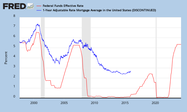
Adjustable Rate Mortgage Vs. Federal Funds Rate

This page is created to monitor the 1 Year Adjustable Rate Mortgage Average Vs. Effective Federal Funds Rate.

The Fed Funds Rate (red chart) sets the short term rates, in particular the 1 Year Adjustable Mortgage Rates.

Whenever the Federal Reserve increases/decreases the lending rate between banks, the short term rates will follow suit.

30 Year Fixed Mortgage Rate Vs. 30 Year U.S. Treasury Yield

This page is created to monitor the 30 year Conventional Fixed Mortgage Rate Vs. 30 year U.S. Treasury Yield.

There is an obvious historical correlation here. The thing to watch here is that the mortgage rate (blue chart) should always be higher than the treasury yield (green chart).

When this is not the case, U.S. treasury yields should decline / mortgage yields should increase.

30-year mortgage rates:


Wage Inflation Vs. Unemployment Rate

This page is created to monitor the Average Hourly Earnings of Production Vs. Unemployment Rate.

When unemployment declines (yellow chart), wages inflate (blue chart).

Wage Inflation Vs. CPI

This page is created to monitor the Average Hourly Earnings of Production Vs. Consumer Price Index (CPI).

The Average Hourly Earnings (blue chart) are a good indicator for the Consumer Price Index (CPI) (red chart). 

It appears that the CPI is most volatile here, so the important trend to follow is the average hourly earnings.

Initial Jobless Claims Vs. S&P

This page is created to monitor the Initial Jobless Claims Vs. Standard & Poor's Index (S&P).

Whenever you get higher initial jobless claims (blue chart goes down), the S&P follows suit (red chart goes down).


Initial claims are a leading indicator for the unemployment rate.

Why you shouldn't buy Japanese equities

This is why you shouldn't buy Japanese stocks to profit on it as an American citizen. As the Nikkei goes up, so does the Yen decline against the USD. 

So your profit is zero.

Source: Eureka Report

Correlation: Gold Bottoms out on Marginal Cost of Suppliers

The gold price has always followed the marginal cost of suppliers throughout history (Figure 1).
The correlation between gold prices and gold mining cash costs between 1980 and 2010 stood at 0.85, which is pretty highly correlated (Source: CPM Gold Yearbook 2011).

With the price of gold at $1400/ounce today I'm pretty sure we can't go much lower if this correlation proves to be correct (Chart 1).
Chart 1: Marginal cost suppliers of gold (Source: Eurekareport)

If we only look at the cash operating costs, we have this picture (Chart 2):

Chart 2: Production cash cost
Let's analyze these charts further. While cash operating costs only went up a little bit to $700/ounce (Chart 2), the total marginal cash costs went up to $1300/ounce in 2013 (Chart 1). So the biggest move in total cash cost came from overhead, discovery, construction and sustaining capital. In the 1980's, we see that cash operating costs contributed the most in the total cost of mining, but today, the biggest chunk of the costs go to overhead, discovery, construction and maintenance. A summary of the cost structure is given in chart 3.

Chart 3: Replacement cost for an ounce of gold
For investors, the key point to keep in mind is that cash operating costs aren't a good indicator for the gold price. You need to look at the overall costs of replacement and that includes all additional costs to mine gold. That total cost will dictate the price of gold.

I hear many analysts say that gold will go to $10000/ounce. I don't think this will happen soon, unless the total marginal cost goes up the same amount. This could happen when energy, labour, exploration, maintenance, construction costs go up or when ore grades go down. At the same time, some people say gold will go back below $1000/ounce. This is not possible because marginal cash costs are rising and we know that there is a high correlation between marginal cash costs and the gold price. 

The following chart is the most important chart every gold investor needs to be aware of. As I mentioned before, there is a high correlation between the all in cash costs of gold mining and the gold price (Chart 4).

Chart 4: All in Costs Vs. Gold Price
The gold price will therefore always follow the cost of mining which proves another important point. The rising gold price is an indicator of inflation because the higher cost of mining is a direct result of inflation.

Now consider the following. We see that many development stage gold mining companies have had increases in their exploration spending and many of these companies have had upward revisions in their feasibility studies. To name a few examples: Kinross Gold (KGC) and Novagold Resources (NG). So if capital spending on all of these projects go up, it isn't too difficult to see that the gold price will keep rising in the future.

Chart 5: Gold Exploration Spending


zaterdag 20 april 2013

Capacity Utilization Rate Vs. Consumer Price Index

This page is created to monitor the Capacity Utilization Rate Vs. Consumer Price Index (CPI).

When capacity utilization goes above 80%, the industry goes above a threshold where it lacks capacity to produce. At that moment the only way to rebalance is to increase prices.

When the capacity utilization goes above 80% (blue chart), the CPI (red chart) will follow suit after 1 year as capacity utilization is a leading indicator for inflation.


Capacity Utilization Rate Vs. Unemployment

This page is created to monitor the Unemployment Rate Vs. Capacity Utilization Rate.

Historically, when the capacity utilization rate goes up (blue chart goes down), the unemployment rate goes down (red chart).

We also know that a high capacity utilization rate points towards inflation. Inflation points towards a higher CPI and a higher CPI means higher average hourly wages. Higher wages point to lower unemployment. And the circle is round.


U.S. Federal Reserve Balance Sheet Vs. Dow Jones

This page is created to monitor the U.S. Federal Reserve Balance Sheet's assets Vs. Dow Jones.

Whenever the Federal Reserve expands its balance sheet (blue chart), the Dow Jones will rise with it (red chart). 
Conversely, when the Federal Reserve Balance sheet stays flat, the Dow Jones is likely to drop.

Money Velocity Vs. Bond Yield

This page is created to monitor the Money Zero Maturity Velocity (MZM velocity) Vs. 10 Year U.S. Treasuries.

Historically, both are correlated. If money velocity picks up (blue chart), 10 Year U.S. Treasury Yields will rise (red chart).


Gold Vs. 10 Year U.S. Bond Yield

This page is created to monitor the Gold Price Vs. Bond Yields.

Historically, when the 10 Year U.S. Bond Yield declines (blue chart), gold will have an up move (red chart).


The same chart but with the Fed Funds rate.


The red line on the chart below is actually the equivalent of the TIPS yield (Treasury Inflation Protected Securities), which is the Treasury Yield of U.S. Bonds minus the rate of expected inflation. The correlation between TIPS and gold is best visible when we invert the TIPS yield. Source: blog.yardeni.com


Gold is correlated to negative yielding debt.


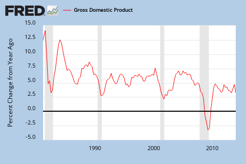
GDP Vs. PMI

This page is created to monitor the Gross Domestic Product (GDP) Vs. ISM Purchasing Manager Index (PMI). 

When the PMI declines (blue chart), the GDP growth rate (red chart) declines.


Industrial production numbers can be used to monitor the manufacturing PMI.

Dow Theory

This page is created to monitor the Dow Theory.

When the Dow Transportation Index declines (blue chart), the Dow Jones (red chart) will follow suit a month after that decline.

China Gold Imports from H.K.

This page is created to monitor China Gold Imports from Hong Kong.
I'm monitoring the gross imports, net imports from Hong Kong to China.
I'm also monitoring the ratio between net imports and gross imports which measures the degree of retaining of gold by China.

China gold imports from Hong Kong are correlated with the SGE gold withdrawals, which can be found here. Although, since the opening of the SGEI in 2014, this correlation is not as obvious anymore.
weekly: http://www.sge.com.cn/xqzx/xqzb/
monthly: http://www.sge.com.cn/xqzx/xqyb/

New link: http://www.sge.com.cn/sjzx/hqyb

To calculate the distortion go here.

China's official gold reserves can be found here.
http://katchum.blogspot.hk/2015/04/china-gold-reserves.html