maandag 23 september 2013

Marc Faber In Thailand, Talking About Clowns

Marc Faber at a Thai studio.

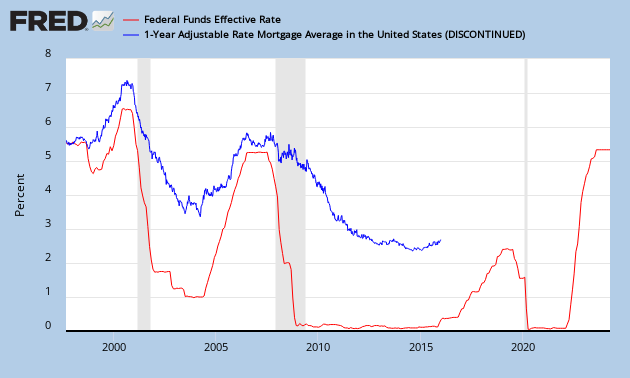
Most important sentence: "The Fed has lost control of long term interest rates". That can be seen here. Even with this money printing and expansion of the Federal Reserve's balance sheet, they can't keep interest rates low anymore.


But more importantly, I note that they have also lost control of short term interest rates. As you can see here, the adjustable mortgage rate is edging up, even when they hold the fed funds rate at zero. So at some point the fed funds rate needs to go up. But there is one other solution, going the other way. Let's see if Janet Yellen is going to apply negative interest rates...


zondag 22 september 2013

Federal Funds Rate Vs. Unemployment

The unemployment rate is a key indicator for the Federal Reserve to set the Fed Funds rate. Whenever the unemployment rate goes up, the Federal Reserve will lower interest rates. 

This can be witnessed on Chart 1 which gives the Employment-Population Ratio Vs. the Fed Funds Rate.

Chart 1: Federal Funds Rate Vs. Employment-Population Ratio
Since the economic crisis of 2008, the employment-population ratio has never really recovered, that's why there is very little incentive to ever increase interest rates.

Be advised that we need to look at the employment-population ratio rather than looking at the unemployment rate numbers, as these numbers are subjected to hedonic measures (discouraged workers, part-time workers), which started from 2008 onwards. To show this, look at Chart 2. You will see that since 2008, the correlation didn't apply anymore.


Indeed, the U.S. government has been manipulating the unemployment numbers since 2008 (Chart 3).

Chart 3: Unemployment Rate

zaterdag 21 september 2013

Why Eric Sprott bought San Gold Corp.

As gold prices and gold mining shares rebounded on the news that the Federal Reserve didn't taper its bond purchases in September 2013, there are a lot of opportunities to be found in the gold mining business and I believe we have seen the bottom in gold. In today's environment, everyone is bearish on gold and investors should know that when the future is the darkest, the most money can be made if you are willing to take the risk. I'm not talking about doubling on your principle investment, but rather multiples. The key is to choose the right mining stock. I will focus on one gold mining company which has the potential to give a return of ten to twenty times your investment and I'll explain why. The company in question is San Gold Corp.

Just recently, Eric Sprott said in an interview with Marin Katusa (Casey Research) that he bought a gold mining company that is trading at 2.5% of its four year high while the company actually produces more gold now than several years ago. Via deduction, we know that he is talking about San Gold Corp. as four years ago, the stock traded at $4.5/share, while today it trades at $0.17/share (Chart 1). Indeed, on September 12th, 2013, Sprott Asset Management closed a private placement offering of 32,000,000 units at a price of $0.125 per unit for aggregate gross proceeds of $4,000,000.

Chart 1: San Gold Corp.
The question now is, why did Sprott Asset Management choose this stock? Let's compare the numbers from today to the numbers from 2010, 2011 and 2012.

Table 1: Key Metrics San Gold Corp.
As you can see on chart 2, San Gold Corp. has had net losses during all these years due to declining gold prices and rising cash costs, which made it necessary for them to raise money via equity offerings. But the company is now targeting to have free cash flow at the end of 2013. I believe this target can be reached if gold prices start to rise again in the near future. On the cash cost side, the company reports that these will be flat going forward. Additional equity dilution will be an idea of the past. This is positive element number one: free cash flow.

Chart 2: Earnings Vs. Revenue
Investors have been very negative on the company as the share price declined over these 4 years (Chart 3). Surprisingly, the equity value of the company has only gone up since then due to increases in mineral properties, plant and equipment. If you buy shares of this company, you are getting a lot of value. The price to book ratio currently stands at 0.25, which is very cheap. You only get these valuations when you think the company is going bankrupt and that won't happen as they have started to turn the tide with producing free cash flow soon. The key element to keep in mind here is a high book value at a low share price valuation. This is positive element number two: book value.

Chart 3: Equity Vs. P/B ratio Vs. Share Price
If we look at the gold production, we can see very promising numbers (Chart 4). The company has increased production since 2010. In fact, production has doubled since 2010, from 40000 ounces/annum to 90000 ounces/annum today. Revenue (Chart 2) would have gone up if gold prices didn't fall from $1700/ounce to $1300/ounce. If gold were to go back up to $1700/ounce, we are talking about an additional $40 million of revenue. If we add this potential revenue number to the net losses they have today, we would have a net earnings potential of $20 million/annum. At these share prices we would have a P/E ratio of 3. The upside would be immense, I expect a multiple of 5 at least to get back to fair market value. Added to this, we still have plain production growth from its three deposits Rice Lake, Hinge and 007. Production is expected to go to 100000 ounces/annum in 2014 and 110000 ounces/annum when all three deposits ramp up to their production potential in 2015. This is positive element number three: production growth.

Chart 4: Gold Production Vs. Gold Price
And last but not least, we have a huge exploration potential at San Gold Corp. Similar to Goldcorp's Red Lake mining district, which is Goldcorp's top producer, we have the Rice Lake mining district at San Gold Corp. Both districts are geologically similar and are positioned at an 80 km distance from each other. Both mines contain high grade gold and have a low cash cost of production. The only difference we can find is that Rice Lake hasn't really been explored much. The mine produced only one tenth of what Red Lake produced. So there is a great potential embedded in the Rice Lake mining district. This is positive element number four: exploration potential.

Conclusion:
I presented San Gold Corp., a gold mining company with a potentially leveraged play on gold. If I'm right about bottoming gold prices, investors could gain multiples on this stock. Even a small investment would give high returns based on the analysis above. Renowned asset managers like Sprott Asset Management's Eric Sprott have put their money in this company and that shows that they have confidence in this gem.

vrijdag 20 september 2013

QE As Far As The Eye Can See

I don't think we will ever see a taper again and here is why. One simple chart.

As you can see the 10 year treasury yield is now at 3% and surprisingly, this is almost as high as during the 2008 financial crisis, where the yield was 3.6%.

But there is one big difference between then and now and that is that the U.S. public debt has doubled from $9 trillion to $17 trillion. As a result, interest payments as a percent of GDP have gone up.

So today we are worse off as compared to 2008. To keep yields down I don't see any other option than QE to infinity.

There is this question on how long QE can continue to raise equity prices. Do you think this can go on till infinity?

Of course not, first off, I showed with the Potemkin anti-rally that the Dow Jones hasn't been rising along QE. But more importantly, we need to watch what the U.S. dollar is doing.

That's why I made this chart to show the Dow Composite Index, weighed to the U.S dollar index ( blue line). You can see the blue line has been flat lately, even though the Dow Composite went up ( green line). That's because the U.S dollar has been going down recently (TWEXMMTH). The red line shows the expanding Fed balance sheet.

We need to keep monitoring this, because once the green and blue line diverge from each other, we're basically going into hyperinflation mode.

woensdag 18 september 2013

Budget - Trade - Current Account Deficit

It can be interesting to watch how the budget deficit, the trade deficit and the current account deficit evolves over time. As I said before, deficits are inversely correlated with the currency value. Ever since 1970, the U.S. dollar decreased in value as deficits went up. The following chart gives the annual budget - trade - current account deficit.

The budget deficit (yellow chart) is a measure of how much the federal government is spending more than it receives. The budget deficit = Federal government spending minus Federal government receipts. We currently have an annualized $1 trillion budget deficit.

The current account (BOPBCA) (green chart) is simply a measure of how much money is flowing out of the country compared with how much is flowing in from foreign sources.

The balance of trade (BOPGSTB) (red chart) is the biggest part of the current account. It measures the value of what we sell overseas minus what we buy from overseas. The U.S. trade deficits started since 1970, when the U.S. started to import a lot of oil and consumer goods.

The U.S. has a trade surplus in services and a trade deficit in goods.


The trade balance can be predicted by looking at air freights.


Import and export air freights.


Import and export of all commodities.


Imports and exports of goods and services.


High deficits lead to currency devaluation.


The current state of the budget deficit:


No Taper From Fed?

As predicted here, there was no way that the Fed was going to taper.


Just wanted to put a souvenir on the blog. Gold shot up almost 3% while silver shot up more than 3%.


Now what do we have to expect from the future then?

Of course, precious metals are the place to be. U.S. bonds can be bought for a quick trade. Equities will follow the continued balance sheet expansion upwards. Cash is the worst you can have in your pockets as the U.S. dollar will drop, especially with the increase of the debt limit soon.

dinsdag 10 september 2013

Update on COMEX gold

A small update on how the COMEX is doing. As we can see on this chart, the blue line is getting closer and closer to a blow up. Soon there is no registered physical gold left in any vaults of the COMEX. Maybe we'll see something happening in October 2013.


I have always said that open interest should follow the amount of registered gold, because the COMEX needs to have the physical stock available in order to leverage their paper gold contracts.

What we see now is that open interest is much higher than the registered gold at the COMEX.

The black chart below shows the immense leverage.


What is the result? You won't get your gold anymore. Grant Williams reports that people cannot get anymore physical gold at the GLD ETF.

And with this news, we will see that the physical gold stored at GLD will not go down anymore. Indeed, when you make the chart of GLD ETF, you can see that the red chart isn't going down anymore. (Maybe they don't even have the physical gold at GLD...)

This also means that extra supply of gold going onto the market by selling physical gold from GLD won't happen anymore and when extra supply won't come, the gold price cannot be manipulated lower by the ETF's (like we saw in 2012).


I think there is a good chance that we see a bottom here.


Net Turnover Vs. Change in Non-Farm Payrolls Vs. Change in Unemployment Rate

The non-farm payroll number is a leading indicator for the unemployment rate. Check the economic tracker to predict the NFP numbers.


Watch the household employment level vs. non-farm payrolls. Household employment level surveys actually include small businesses unlike non-farm payrolls. Household employment is a leading indicator as small businesses adapt much faster than large businesses.


There is another way to calculate the non-farm payroll numbers and this is called the JOLTS (Job Openings and Labor Turnover) data. When you subtract hires and separations from each other, you get the change in non-farm payroll numbers.

Change in NFP = Hires - Separations.

JOLTS data is more accurate than the NFP data (which gets revised a lot). You can use the JOLTS data to predict the NFP data and with NFP data, you can predict the trend of the unemployment rate.

Job postings give an idea of the trend.
   

The Beveridge Curve states that the unemployment rate will rise when job vacancies drop below 5%.


donderdag 5 september 2013

woensdag 4 september 2013

Correlation: Trade Balance Vs. Currency Strength

As predicted in this article, the improving trade deficit numbers in the U.S. weren't going to last. It is now flatlined (2014).This brings me to a new correlation.

The trade deficit is correlated to the U.S. dollar.


The following chart gives the monthly U.S. trade deficit (red chart) Vs. the U.S. dollar index (blue chart). If the trade deficit widens (red chart goes down), the U.S. dollar index will drop (blue chart goes down).


As you know, a trade deficit means that imports exceed exports. Americans buy more stuff from foreigners and in exchange they give money to these foreigners. This money needs to be in the currency of the foreigners. Let's say an American buys a Chinese TV. He will have to pay yuan to the Chinese merchant. To do this, he will convert U.S. dollars to yuan. This will lower the value of the U.S. dollar.

The other way round is also true. China has a trade surplus and will sell its goods to America in exchange for U.S. dollars. These U.S. dollars will be converted to yuan, otherwise the Chinese merchant can't do much with the U.S. dollars in his country. This will increase the value of the yuan.

Of course, there is a lag between trade and currency conversion. This lag is approximately 1 year. As a consequence, the trade balance is a leading indicator for the strength of a currency. The higher the U.S. trade deficit, the more probable that the U.S. dollar will go down in value.

Recently, the trade deficit has improved a lot since 2010, the U.S. dollar strengthened with it. But I believe this improving trade balance has started to roll over.

To show that this correlation is valid, I will give another example: Japan. Macro Man's blog indicates that the Japanese yen is about to collapse if we look at their trade deficit numbers. As the blue chart goes down, the yen should weaken considerably.


If you know that the trade deficit is a leading indicator for currency weakness, you can predict the collapse of the U.S. dollar by just looking at the trade deficit trend. You can position yourself for this collapse in the U.S. dollar by buying precious metals and commodities.

Moreover, when the U.S. dollar goes down, the imports will be more expensive and the exports less expensive, which will add to the trade deficit.

The following chart shows the current account deficit + budget deficit against the U.S. dollar. Also here we see a correlation (although the gap has widened in 2019).