zaterdag 14 juli 2012

How to calculate profit on government bonds? Case Study on Belgian Bonds

A couple months ago, Belgium sold government bonds to the public. For example 10 year bonds at 5%. I'm living in Belgium, so I took this example. I've never really looked at how profits are being made by selling/buying government bonds. So let's analyze this a bit. This is just a note to myself.

Let's take a 10 year Belgian government bond at 5% (Chart 1). Suppose I bought an amount of 1000 euro of these bonds. This means that after 10 years I get paid with: 1000 + 10*5%*1000 = 1500 euro.

Indeed, after 10 years I made 50% profit on the principal. 1000 euro became 1500 euro.
Chart 1: Belgium 10 Year Government Bonds
What happens when 7 months later, bond yields go down to 2.65%, like today is the case (Chart 2).

Chart 2:  Belgium 10 Year Government Bonds

Let's reperform the calculation. If I buy an amount of 1000 euro of these 10 year Belgian bonds. I get repaid with: 1000 + 10*2.65%*1000 = 1265 euro.

So after ten years my 1000 euro becomes 1265 euro. That's a 26.5% profit in 10 years.

Now comes the clue. If I sell my 10 year Belgian bonds (with 5% interest) on the market, as compared to the current rate of 10 year Belgian bonds today (with 2.65% interest), I will make profit.

That profit is: 1500 - 1265 euro = 235 euro. 
How much percent profit is that? 235/1000 = 23.5%

That's a pretty high profit if you ask me. Gold has been doing worse in those 7 months, it went up only 5% in euro terms.

Now let's go a bit further. If the interest would be cut in half again from 2.65% to 1.25%, what will be my profit?

1265 - 1125 euro = 140 euro
My percentage profit = 140/1000 = 14%

And when it gets cut in half again from 1.25% to 0.625%.
1125 - 1062.5 = 62.5 euro
My percentage profit = 62.5/1000 = 6.2%

And when it gets cut in half again from 0.625% to 0.312%.
1062.5 - 1031.2 = 31.3 euro
My percentage profit = 31.3/1000 = 3.1%

You see, the lower the interest rate is, the less profit you can make in proportion to the yield cut. I can't understand how people still want to buy these government bonds at these low yields.

Talking about a bond bubble... it's staring right in your face. U.S. 10 year government bonds are now at 1.5%. If that yield would go to 0%, you could make only 15% profit. Gold will ultimately go much higher than this 15%.


Edit:
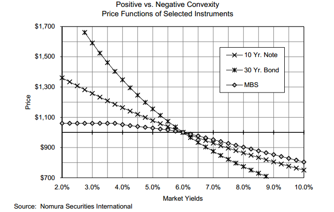
I still haven't figured out how to calculate the yield-price bond curve the correct way. But instead I'll just use the Nomura curve here, much easier:


vrijdag 13 juli 2012

Funny Peter Schiff Video about Student Loans

Diana Carew VS. Peter Schiff. 

I am worried about the debt of students these days. How in the world are they going to pay it off... They need at least 5 years to pay off their debts. In Europe, we start with savings after graduating, in America they start with debt...


The Status on Silver

This article is a summary on the most recent developments in the silver market. I will talk about the silver technicals, silver-gold ratio, silver investment, silver depletion, silver long/short positions and silver warehouse stock.

Let's start with the technicals. A pretty concerning picture for silver can be witnessed on the gold-silver ratio chart (Chart 1). You can see that in mid 2010, silver started to outperform gold until mid 2011. During that period, silver went from $US 18/ounce to $US 50/ounce (Chart 2). But recently, the silver price underperformed the gold price, with the gold-silver ratio going back to 60.
Chart 1: Gold - Silver Ratio
Chart 2: Silver Price
However, based on historical gold-silver ratios, we could go back to a 16:1 ratio as the trend in the gold-silver ratio is downwards (chart 3). We already had a second peak in 1992 at gold-silver ratio of 94 and we will go back to the low of 16.

Chart 3: Long Term Gold - Silver Ratio
Last year, silver had been doing well, going to $US 50/ounce and a gold-silver ratio of 30. Recently, we saw a correction in the gold-silver ratio back to 60. I believe that correction is over and many other investors including Eric Sprott acknowledge this. We're approaching a key technical point of a wedge pattern. Either we'll get a huge move to the upside or we get a huge move to the downside. I believe we'll see upside and we already see evidence of this. Just recently, the Sprott Physical Silver Trust priced in a follow-on offering of silver trust units in an amount of $US 200 million.

The fundamentals of silver are getting better and better every day. Concerning the depletion of silver, the New Scientist forecasted in 2005 that silver would be depleted in about 15-20 years. This means today we have only 10 years of silver left. Unlike gold, silver is being consumed as it is used in many applications. After consumption, the silver will be thrown together with its applications into land fills and will never be recovered. You could argue that silver can be recycled, but studies have shown that the recycling of silver is not feasible below a price of $US 50/ounce.

Silver scrap is a very important factor in supplying the silver to the markets because it comprises 22% of total silver supply. Since year 2000, the silver scrap to silver supply ratio has been steadily declining. Only just recently in 2011 we saw a spike in the silver scrap to silver supply ratio to 24.7% (Chart 4). This spike is due to the record high price of silver in 2011 ($US 50/ounce), which spurred investors to recycle jewelry and silverware. I expect this number to come down in 2012 as the silver price has been correcting.

Chart 4: Silver Scrap to Silver Supply ratio

Events like the offering of the Sprott Physical Silver Trust add to the velocity of depletion as investment demand will take silver supply out of the market. Manipulation of bullion banks to decrease the silver price only adds to the demand of investors to buy silver. We see this in the Silver Institute's 2011 report on silver demand/supply. The demand for silver coins went up an astonishing 18%.

On the net short positions of silver I want to make clear to investors that we are approaching a decade low in the Large Commercial Net Short positions (LCNS). Historically, when LCNS goes up, the price of silver goes with it. Basically this means that a huge spike to the upside is imminent.

Chart 5: LCNS silver
On the COMEX silver front we note that registered silver went up from 29.0 million troy ounce (25 April 2012) to 38.7 million troy ounce today, indicating that physical silver has been stocked in COMEX warehouses. Total silver inventories rose from 140.6 million troy ounces (25 April 2012) to 144.4 million troy ounces today (Chart 6). Rising stocks typically mean that there is less demand for silver, declining stocks typically mean there is more demand for silver. On chart 6 we see that stocks had been slowly rising in the previous months (less demand), but more recently, the stock has been declining again since the start of July 2012. Demand is picking up again due to seasonal strength in precious metals (month of July).

Chart 6: COMEX silver stock
On the more fundamental side of the economy we noted a very interesting event in the deposit facility of the ECB. Overnight deposits declined by more than half due to the ECB deposit rate cut. This 500 billion euro will basically find its way somewhere, possibly in the precious metals market.

Conclusion: It should be a very good time to invest in silver.

donderdag 12 juli 2012

ECB Overnight Deposits Drop by more than Half

As I already predicted in this article, the ECB overnight deposit dropped. It didn't drop by a bit, it dropped  in HALF and it's not a glitch.

Now where will this 500 Billion Euro go, I wonder. I'll keep you posted, stay tuned.

They could go to: bonds, gold, real estate, land, overseas currencies.

500 billion euro is not a little bit of money, it is huge. The financial stimulus in 2008 was comparable to this 500 billion euro. You can buy a lot with this money. Deutsche Bank is only 20 billion euro in market cap. The whole silver market is only worth 20 billion euro. Even Citigroup is worth only 50 billion euro.

So I expect something big to happen in the equity markets and especially in the precious metals market.

Chart 1: ECB overnight deposits


Eric Sprott Taking Silver Off The Market With Offering

Yesterday, Eric Sprott priced a follow-on offering at $US 200 million, which is a 20% increase in its silver holdings. This will certainly increase the silver price at a faster pace by taking silver away from the market. Eric said silver would be at $US 50/ounce at the end of the year, maybe he's just trying to speed it up to get his call on being right. :-)

Too bad for PSLV holders who lost 4% premium, but I'm sure it will go much higher in the future.

Chart 1: PSLV Price Vs. Premium
P.S.: I'm going to stop monitoring the premium now as the PSLV site finally gives me the PSLV premiums in a nice chart! Looks like my requests came true. My first blog post ever, was about the PSLV premium and how it wasn't available on the PSLV site.


Sprott Physical Silver Trust Prices Follow-on Offering of Trust Units In An Aggregate Amount of US$200,005,000

TORONTO, July 12, 2012 /CNW/ - Sprott Physical Silver Trust (the "Trust") (NYSE: PSLV / TSX: PHS.U), a trust created to invest and hold substantially all of its assets in physical silver bullion and managed by Sprott Asset Management LP, announced today that it has priced its follow-on offering of 18,100,000 transferable, redeemable units of the Trust ("Units") at a price of US$11.05 per Unit (the "Offering"). As part of the Offering, the Trust has granted the underwriters an over-allotment option to purchase up to 2,715,000 additional Units. The gross proceeds from the Offering will be US$200,005,000 (US$230,005,750 if the underwriters exercise in full the over-allotment option).

The Trust will use the net proceeds of the Offering to acquire physical silver bullion in accordance with the Trust's objective and subject to the Trust's investment and operating restrictions described in the prospectus related to the Offering. Under the trust agreement governing the Trust, the net proceeds of the Offering per Unit must be not less than 100% of the most recently calculated net asset value per Unit of the Trust prior to, or upon determination of, pricing of the Offering.

The Units are listed on NYSE Arca and the Toronto Stock Exchange under the symbols "PSLV" and "PHS.U", respectively. The Offering will be made simultaneously in the United States and Canada by underwriters led by Morgan Stanley and RBC Capital Markets in the United States and RBC Capital Markets and Morgan Stanley in Canada.

Copies of the U.S. prospectus related to the Offering may be obtained by contacting Morgan Stanley & Co. LLC, 180 Varick Street, 2nd Floor, New York, New York 10014 Attention: Prospectus Department (telephone 866-718-1649 (toll free) or 917-606-8474) or by e-mailing prospectus@morganstanley.com, or RBC Capital Markets, LLC, Attention: Prospectus Department, Three World Financial Center, 200 Vesey Street, 8th floor, New York, New York 10281-8098 (telephone: 212-428-6670, fax: 212-428-6260). Copies of the Canadian prospectus related to this Offering may be obtained by contacting RBC Capital Markets, Attention: Distribution Centre, 277 Front St. W., 5th Floor, Toronto, Ontario M5V 2X4 (fax: 416-313-6066) or Morgan Stanley & Co. LLC 180 Varick Street, 2nd Floor, New York, New York 10014 Attention: Prospectus Department (telephone 866-718-1649 (toll free) or 917-606-8474) or by e-mailing prospectus@morganstanley.com. The Offering in Canada is only being made by the Canadian prospectus, which includes important detailed information about the Units being offered.

This news release does not constitute an offer to sell or a solicitation of an offer to buy the Units, nor shall there be any sale of the Units in any state or jurisdiction in which such an offer, solicitation or sale would be unlawful prior to registration or qualification under the securities laws of any such jurisdiction.

For further information:

Investor Contact Information:
Sprott Physical Silver Trust
(416) 203-2310 or Toll Free: 1 (877) 403-2310
Email: bullion@sprott.com

woensdag 11 juli 2012

Composition of Fed Balance Sheet Indicates Low Interest Rates For Eternity

I have been talking a lot about the federal reserve balance sheet. But what is it composed of? And how did it evolve higher?

Chart 1 gives the composition. You can see that QE1 and QE2 were mainly bond purchases (light brown area). QE3 should be another round of bond purchases and should expand the light brown area again.

Second, the spike in 2008 was mainly lending to financial institutions at the time of the banking collapse. This lending has been paid off in 2010.

But the most interesting part is the mortgage backed securities area in brown. In that period, congress passed the Emergency Economic Stabilization Act of 2008, which authorized the Treasury to purchase mortgage-backed securities. As a consequence, the brown area increased in size at the same time when lending to financials decreased. That means that the federal reserve has bought approximately $US 1 trillion of mortgage backed securities in an attempt to support the housing market. It didn't do much to the housing market. New home sales and housing starts were flat, but the housing market index improved a bit though.

I will point out the importance of convexity to make my case of lower interest rates in the foreseeable future.
Chart 1: Federal Reserve Balance Sheet
To read the analysis go here.

dinsdag 10 juli 2012

China May 2012 Gold Imports from Hong Kong Still in an Uptrend

A little update on China's gold imports from Hong Kong. For May 2012, China imported 75.6 metric tons from Hong Kong. Pretty disappointing if you ask me, but the trend is still going up. The May 2012 imports are a sixfold increase from a year earlier, but down from April 2012's record.

China Gold Imports from Hong Kong
Chart 1: China Gold Imports from Hong Kong

ECB Rate Cut and its Effect on Euribor

On Thursday 5 July 2012, the ECB cut its main refinancing rate to 0.75% and its deposit rates to 0%. After LTRO I and LTRO II, we have another stimulus to supply credit to the markets.

In my previous article on LTRO I, I noted that the Euribor was manipulated lower to make it easy to lend (Chart 1). 

Chart 1: 3 Month Euribor

But it wasn't working out for the markets, because all the money was kept at the ECB deposit facility (Chart 2).
Chart 2: ECB Deposit Facility

Then, we got the interest rate cut of the ECB, and that lowered the Euribor another step from 0.64% to 0.55% as witnessed on Chart 1 (see the little spike downwards).

So what does all this mean for you? Read the analysis here.

zondag 8 juli 2012

How Likely is QE3? 70% likely.

Ben Bernanke has been saving his ammo in the past months. Each time the fed meeting was held, markets were hoping for QE3, but they didn't receive any. This is evidence by the U.S. federal reserve balance sheet on Chart 1.

Chart 1: U.S. Federal Reserve Balance Sheet

Today, we have passed several months and we already see that the economy is starting to deteriorate. Not only in Europe and the emerging markets, but especially in the United States. In this article I will focus on the key macroeconomic data in the U.S.

Angela Merkel With Hitler Moustache

Today at 18:00 on the Dutch NOS News, we could see Angela Merkel with a Hitler Moustache. Of course unintended, but it begs the question: "why do people even notice"?

Is Angela's mandate so similar to Hitler's? I disagree.

We could argue that Angela is pro austerity, but her actions are all but pro austerity. The best example is the bailout of the PIIGS by Germany.

Anyway, I just couldn't resist posting this nice souvenir to Angela Merkel.

Angela Merkel's Hitler Moustache at NOS News