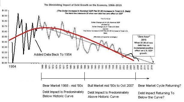
I don't know if I've shown this curve yet, but it is too important not to talk about it.
We are in 2012, the time where additional debt doesn't grow the economy. Which means you need to print an eternal amount of money to grow GDP. This means hyperinflation.
Everything will collapse soon, so I would place my money in precious metals.
Chart 1:
Chart 1:

http://seekingalpha.com/article/289000-is-zero-hour-debt-saturation-upon-us
Another sign of the end nearing is the outlays (government spending (pensions, medicare, social security)) compared to foreign debt. Historically, once 40 % of outlay spending comes from foreign debt, then the country is relying too much on foreign debt for its spending needs and this results in hyperinflation (James Turk: http://www.fgmr.com/more-deficits-more-debt.html).
Quote (James Turk): As further proof that the Havenstein moment is behind us, consider that 58% of the money spent by the federal government in October and November came from borrowed money ($320 billion of debt against $551 billion of expenditures). Monetary history shows that governments are on a hyperinflationary path when crossing the 40% threshold, a level long passed by the federal government.
Following chart shows the level of deficits relative to expenditures before hyperinflationary periods. As you can see, above 40% means hyperinflation:
Chart 2:

http://www.financialsense.com/contributors/john-mauldin/inflation-and-hyperinflation
Following chart says that Japan and recently USA are on the verge to go to hyperinflation:
Chart 3:

http://www.financialsense.com/contributors/john-mauldin/inflation-and-hyperinflation
For 2010:
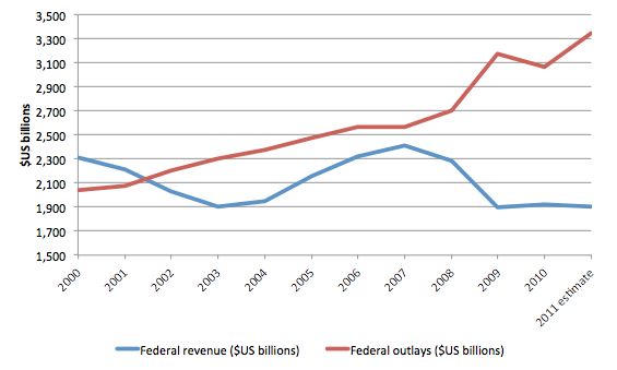
Outlays in 2010 (see chart 6): 3,3 trillion USD
External Debt increase in 2010 (see chart 4 and 5): 1.3 trillion USD
1.3 trillion USD / 3.3 trillion USD = 39 % (almost hyperinflationary)
Chart 4:
http://gold.approximity.com/Fortune_gets_it_wrong_on_gold.htm
Chart 5:
http://www.usgovernmentspending.com/federal_deficit_chart.html
Chart 6:

Just having discovered your blog, I am going through your old blog-posts, and I find this one interesting. I think it is beyond doubt that public inflation expectations due to money supply increases helped ETF demand push the price of gold to its September 2011 peak.
BeantwoordenVerwijderenWhat the general public did not immediately factor into the equation, was that inflation is only created once the new money is circulating in the economy. The TARP did not generate new credit, and later the inflationary impact of the increase in base money was sterilized by increasing bank's reserve requirements.
The impact of the reserve requirement increase has been staggering. From being only 5% of risk weighted assets, average bank reserves are around 15% today. That means a reduction in the money multiplier from 20 (invers of 5%) to less than 7 (invers of 15%), which would have meant a reduction in money in circulation of close to 70%, had this not been countered by the increase in base money.
It is difficult to see banks increasing their reserves further, so the time to expect materialization of the inflationary effects of QE3 is from now onwards. This is likely to materialize only once US unemployment reaches below 6%.
Indeed, inflation will mostly only be visible when money supply actually starts dropping.
VerwijderenSee this correlation:
http://katchum.blogspot.be/2014/01/m1-and-cpi-are-negatively-correlated.html